
Hello friend, I am Tapas, today I will teach you how to create a simple button hover effect using HTML and CSS. In the world of web design, small interactions make a big difference. If you move the mouse over a simple button and the color changes, a small button will be bigger and create a shadow, then it will look very professional. And this small change is called the button hover effect.
So friends, in today’s blog we will learn:
- What is Hover Effect?
- Why is this importent?
- How to create a simple button hover effect?
- How can you create this button with HTML and CSS?
- Customization Tips
Table of Contents
ToggleWhat is Hover Effect?
- Changing Colors
- Changing Size
- Add Shadows
- Animation
Why is this importent?
- User Experience: If a website’s buttons are attractive, the user experience improves and the number of clicks on the button increases.
- Increases conversion rates: CTA buttons on the website, such as sign up and buy now, are also attractive.
- The website looks professional: Animated buttons are much more modern than static buttons. Using them can make your website look professional.
Create Simple Button Hover Effect:
So friend, I have written the entire code in a code highlight, you can paste it into a file. Let’s get started:
					<!DOCTYPE html>
<html lang="en">
<head>
    <meta charset="UTF-8">
    <title>Simple Button Hover Effect</title>

    <style>
        body {
            margin: 0;
            padding: 0;
            height: 100vh;
            display: flex;
            justify-content: center;
            align-items: center;
            background: #f4f4f4;
            font-family: Arial, sans-serif;
        }

        .btn {
            background-color: #3498db;
            color: white;
            padding: 14px 30px;
            font-size: 18px;
            border: none;
            border-radius: 6px;
            cursor: pointer;
            transition: all 0.3s ease;
        }

        .btn:hover {
            background-color: #2ecc71;
            transform: scale(1.08);
            box-shadow: 0 8px 20px rgba(0, 0, 0, 0.2);
        }

        .btn:active {
            transform: scale(0.98);
        }
    </style>
</head>

<body>

    <button class="btn">Click Me</button>

</body>
</html>
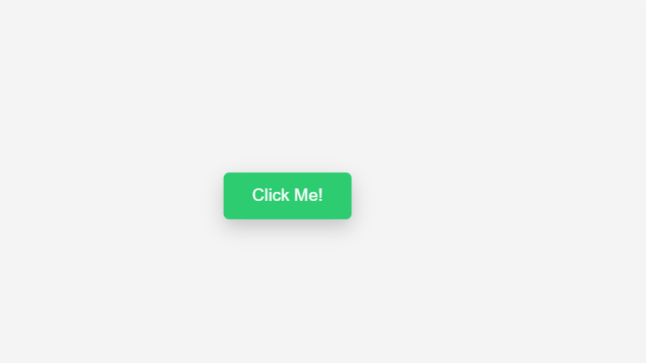
Output:
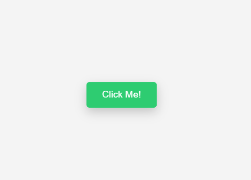
Explain Code:
- transition: all0.3 ease: This attribute smooths out the hover transition. If it is not given, the button changes abruptly and is not very user friendly.
- trasform: scale(1.08): This attribute makes the button 8% larger. You can make it larger or smaller if you want.
- box-shadow: This attribute adds a shadow under the button, creating a 3D effect.
- :active: This attribute makes the button slightly smaller when clicked and makes it feel like a real button.
Customization Button:
Change Color:
If you want to change the color of this button:
background-color: #yourcolor;
If you want to make it bigger:
transform: scale(1.15);
only change color:
.btn:hover Just put the background color inside it. Conclusion:
Today in this blog we will show you how to create a simple button hover effect. You can make your website more modern, attractive and professional with just a few lines of CSS code. If you are learning web development then apply this code to your project.
